Design Process
Our process is based on the Double Diamond Theory and Lean UX principles. The Double Diamond Theory puts an emphasis on Research and brings it to the forefront of the development cycle. Forcing us to gather data that validates the prioritization of the project, will guaranteeing that the we fully understand that problem we are solving for. This process is incorporated in all of our design and development projects. While Lean UX principles incorporate principles that encourage iterative design and shared understanding across the product team including Designers, Developers, Front End / Back End Engineers, Product Owners and QA.
Discover
I collaborated with the Product Owner to guarantee that feature was correctly prioritize and that we understood the problem we are trying to solve with the new design.
Explore and Define
Through internal and external user interviews I was able validate the problem statement, better understanding the users ideal workflow and gathering feedback for additional features. In collaboration with the Product Owner I was able to define a minimum viable product, that we would develop and then use to gather additional feedback.
Develop and Test
As a designer I am highly vested in the actual execution and development of the designs I propose. Thus I make myself as a resource to the development team. I create extensive documentation to clarify my design decisions and I am always available answer any questions or address any discrepancies.
Once the Product Team feels we have a finished product, I will conduct a round of usability tests with our end users to verify we have met their needs and presented a intuitive user friendly design solution that speaks directly to their pain points.
Deliver and Listen
I believe iteration is critical to the long term success of a product. the requires listening to user feedback post release and prioritizing improvements and version 2 updates in the roadmap.
User Research and Product Research
The decision was made to introduce a new product which introduced elements of gaming, triggers and rewards to the Time and Attendance and Workforce Management Applications. The goal was to increase engagement, by speaking directly to a new generation of managers in a way that more closely mirrored application they would be accustomed to in the consumer market.
In order to validate our assumptions, we pulled data from our google analytics account, focusing on sessions and session duration across all apps and at key properties. We were able to confirm a significant 24.5% drop in user session in May of 2021, while 808 new users were added to the platform in April alone. This confirmed that new users were not engaged in the system at the same level as previous users.
Though we had data on our users and an innovative design team, we were venturing into a new domain, which we internally referred to as "Gamification." In order to ensure we delivered a high quality solution and didn't make any decisions based on our own assumptions, I led to effort to partner with Balanced Media Technology, a DFW based firm that specialized in data-science, interactive media and computer gaming. In collaboration with Balanced Media we were able to define a Game Loop and identify areas to inject gaming elements into our existing user flows.

To better my understanding of the psychology behind gamers and what drives users in this space to make decisions, I began reading a book titled "Reality is Broken" by Jane McGonigal. I gathered many valuable takeaways from the book, I suggested each designer read the books as well and we all presented our thoughts in a weekly design meeting.
To better my understanding of the psychology behind gamers and what drives users in this space to make decisions, I began reading a book titled "Reality is Broken" by Jane McGonigal. I gathered many valuable takeaways from the book, I suggested each designer read the books as well and we all presented our thoughts in a weekly design meeting.
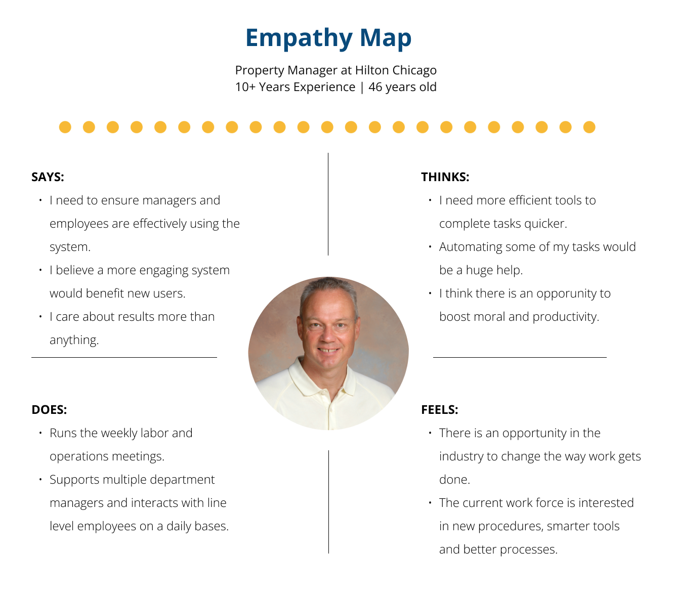
I interviewed 5 of our most active users including Property Admins, Property Managers, Shifts Managers and line level employees. The focus was to understand their motivations for using the current platform and to get their feedback about the proposed features. These interviews were conducted remotely.
Synthesis Input / Research Data
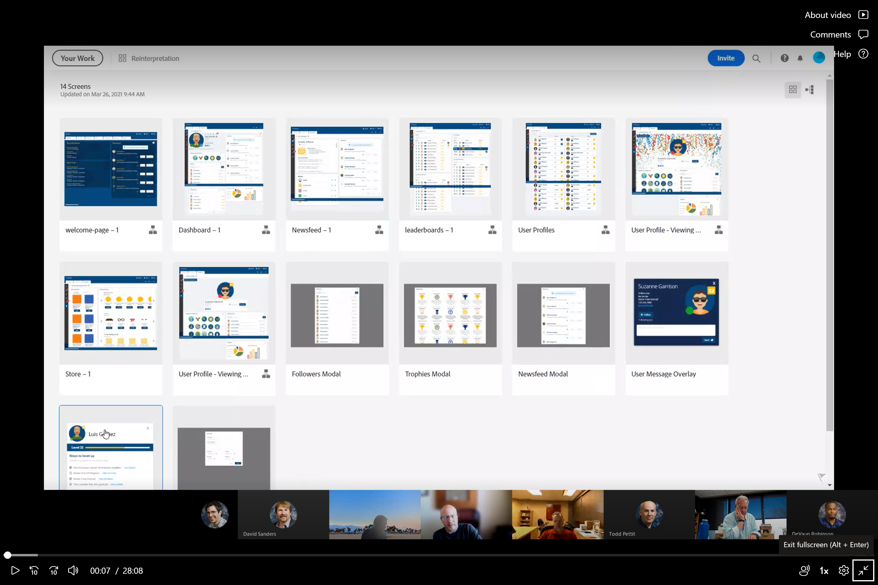
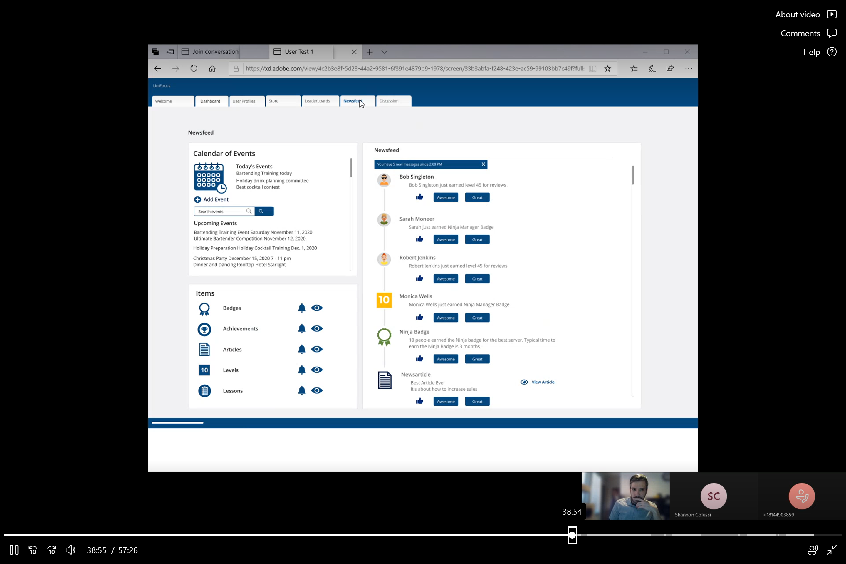
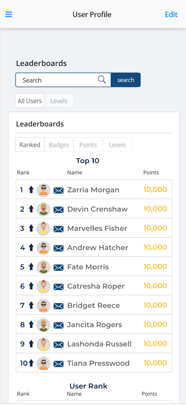
Our research showed, that, though useful this concept would be less impactful at engaging managers and helped inform the decision to limit the scope for version 1 of this project to the Employee facing application, while focusing on Five core modules: User Dashboard, User Profile, Leaderboard, Discussion Board and Newsfeed.
Through our research we were also able to compile a list of key features our clients felt would impact Manager to Employee communication and adoption of the new product.
- Managers would like to reward employees for accepting urgent pick up requests and passing job knowledge quiz or evaluations.
- Managers like the idea of leaderboard ranking employees based on performance but only performance directly related to their jobs.
- Managers want the ability to send out recognition to employees who perform well In both one on one and group settings.
With the data collected we were also able to create user personas and empathy maps for the user roles identified.

Narrowing Down Ideas
In order to quickly get the product to market, avoid scope creep and start learning from our users, the decision was eventually made to limit the Version 1 MVP to include employee facing modules only, User Dashboard, User Profile and Leaderboard. The Discussion Board and Newsfeed were slated for Versions 2, where we would put more emphasis on Manager to Employee communication.
Though the scope of the project was narrowed down, I wanted to guarantee that all of the features in the design were necessary for the v.1 release and weren't just nice to haves.
Avatar Generation Tool
As part of the design solution, I introduced the concept of using custom avatars that would represent each user in the platform. Users would have the ability to earn points by completing work related tasks and achieving specific badges, which could then be used to unlock specific features and accessories. This feature tested well and also solved a engineering issues, centered around uploading and storing images in our database.
However it introduced other technical issues that would force us to used a third party system and require separate subscriptions to add the feature to future projects or modules in our larger application suite. After weighing the feature impact with the cost implement and scale, its was an easy call to icebox the feature, offer a set of default avatars for users to choose and convince the Engineers to invest in solving the technically issues around allowing the users to upload profile pictures. In the end this approach was very effective, provided a great user experience and played a huge part in adding balance to the interface.
Testing and Iterating
Once designers were finalized and signed off on, I shifted my focus to create design documentation that would ensure that the hand-off from design to development was seamless. The design documentation clarifies the problem statement, contains user research artifacts and clearly outlines each component used in the design, also where to find live code examples of the component in practice. I believe building shared understanding with the development team and to clearly document your design decisions is crucial in this process.
Interviewed 15 users including Property Admins, Property Managers, Shifts Managers and line level employees.
Documentation
Once designers were finalized and signed off on, I shifted my focus to create design documentation that would ensure that the hand-off from design to development was seamless. The design documentation clarifies the problem statement, contains user research artifacts and clearly outlines each component used in the design, also where to find live code examples of the component in practice. I believe building shared understanding with the development team and to clearly document your design decisions is crucial in this process.
Design System and Component Library
Impact and Business Outcome
We received positive feedback from all of our clients, they were able to notice a measurable increase in productivity and recalled multiple instances where their direct reports expressed how much they liked the ability to reach new goals, which essentially gave them feedback that validated how well they were performing at their jobs.
Session duration increased nearly 400% to an average of 7m 49s. The feature improvements implemented as part of this project also played a huge part in obtaining contract to provide our Time and Attendance solution to Starbuck, which helped the company transition into restaurants as new vertical.
.png)


.png)
.png)